
MARKAL – BRANDING & PACKAGING
Modernizing a brand with 75 years of heritage

Markal came to us in 2018 to evolve their brand leading into their 75th anniversary. The problem? Industrial professionals loved their products, but the brand wasn’t memorable due to inconsistent branding and packaging across their product lines. We recommended intuitively renaming and restructuring their product lines in order to achieve as much cohesion as possible. Our end result was an updated, modern, consistent look for a brand that didn’t have to abandon its heritage.

Tastefully italicized, Markal’s new logo represents its decades of industry leadership. The M confidently underlines the brand name and is a key element of the new branding.

Product Naming System
After crafting the logo, it was time to organize and make sense of Markal’s different product lines. Some pre-existing names like Paintstik (solid paint markers) and DURA-INK (ink markers) had substantial market equity, so it made sense to keep those names in play. From there, we devised a system that was straightforward and as consistent as possible by categorizing the products by their main use cases and types of marking substance.

Product Labels & Packaging System
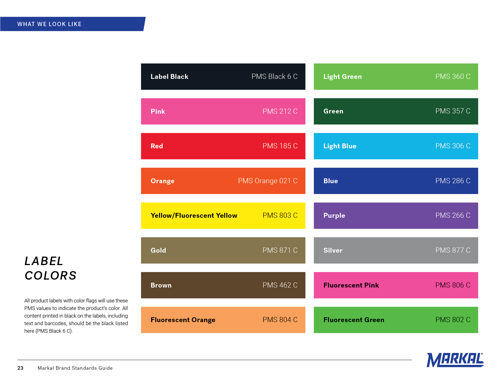
The most important goals during the product label and packaging phase were 1) increasing brand recognition, 2) displaying the sub-brand name and marker purpose (critical action) in a meaningful way, and 3) introducing consistency across all product lines. In order to achieve those goals, we designed a system that turned the Markal logo on its side and making the new sub-brand names hero. Colors and critical actions were housed in a flag-like banner always coming from the right edge of the product.

Old Product Labels & Packaging System

New Product Labels & Packaging System


Role: Design Director & Designer
Designers: Zach Bird & Aaron Sanfillippo