NAVY PIER — UX/UI CASE STUDY
Celebrating the centennial of a Chicago icon
When Navy Pier turned 100 in 2016, we pitched an interactive microsite so Chicagoans could travel back in time and relive Navy Pier's rich history. The result was 100yearsofpier.com. This vertical-scrolling, interactive experience presented Navy Pier’s story using real archived photos, quotes, music, and sound effects from each of Navy Pier's different eras.
Defining the Rules
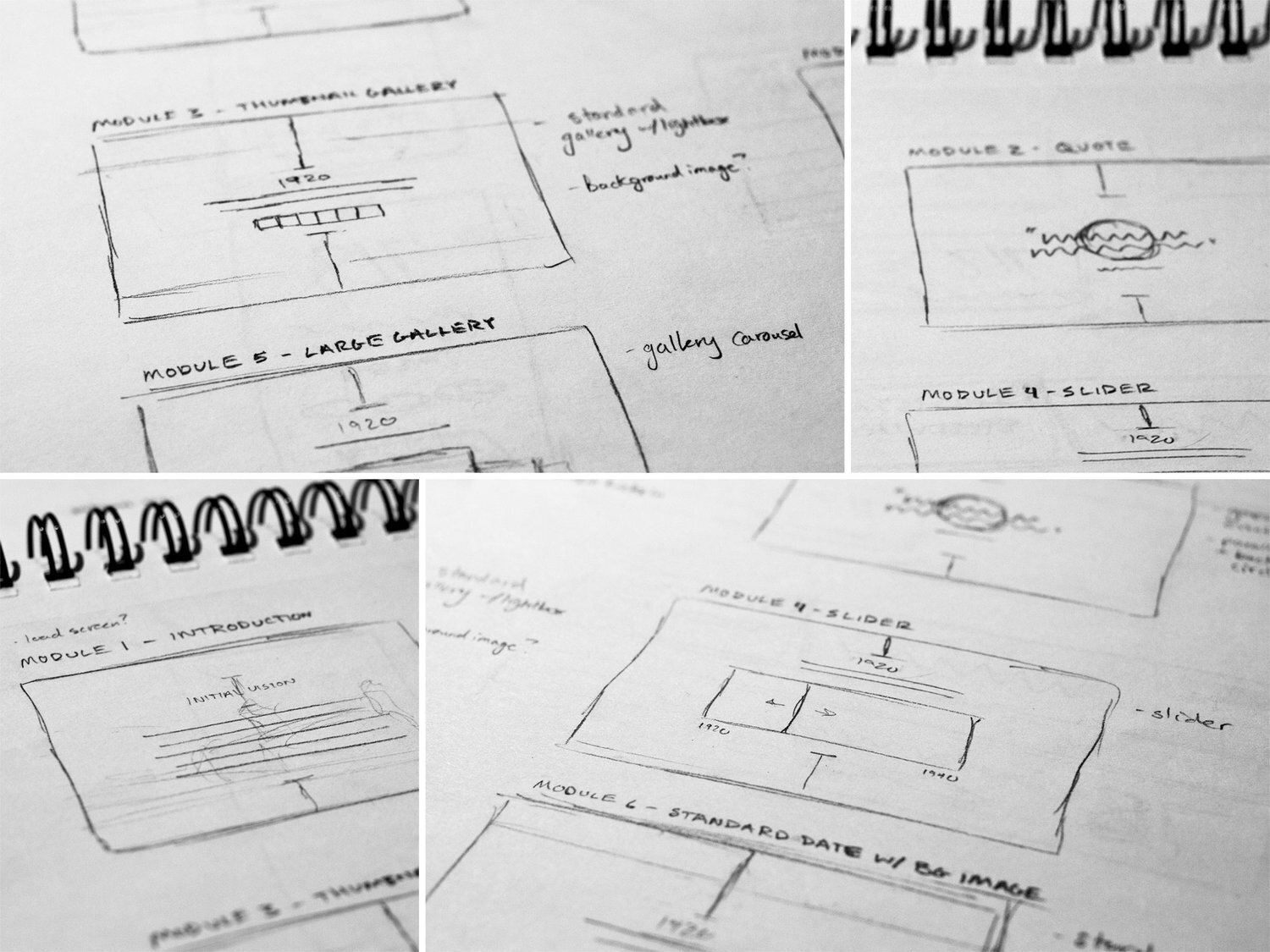
With a limited budget and an expedited timeline, it was imperative to define a set number of reusable modules to tell Navy Pier’s story in order to keep the design and development sprints as simple as possible. We ended up settling on eight different modules varying from section headers, standard text entries, image galleries, and a quote spotlight, to even an interactive “then vs. now” image slider showing Chicago how much Navy Pier has and hasn’t changed throughout its existence.
Initial module sketches used to narrow in on the site’s key building blocks.
Role: Art Director & UX/UI Designer
Creative Director: Adam Von Ohlen
Copywriter: Jackson Moore
Developer: Frey Design Group


