HANGA — UX/UI CASE STUDY
Making it easier for people to get together
Hanga is a mobile app that streamlines every aspect of coordinating a get-together with friends and family—reducing stress and making the process better for everyone.
“Hosts and guests need a way to simplify the get-together planning process because there are too many ways to make it unnecessarily stressful or difficult.”
Defining the Problem
Through conducted user interviews, hosts and guests revealed they primarily rely on group text messages to communicate with each other when coordinating a get-together. However, most people dislike group text messages because they tend to become too chaotic and off-topic. Long text threads also make it difficult to track RSVPs or changes to the host's original plan.
Each user interview consisted of questions for people as both hosts and attendees. This affinity map organized the responses and ultimately informed user personas.
Key Findings from User Interviews
01
Everyone wants to know who is attending, regardless of being a host or guest.
Insight: RSVP list needs to be up-to-date and accessible to all.
02
Everyone wants to know what to expect or what is expected of them.
Insight: Allow hosts to set rules, expectations, and request help.
03
Everyone wants to reduce the amount of work that goes into planning or attending.
Insight: UX needs to be simplistic and offer features users truly need and care about.
Competitive analysis and feature comparison revealed there aren’t many options out there to help coordinate simple get-togethers. Existing apps are too bloated with features users don’t really care about or have poor and confusing user experiences.
Developing a Solution
By focusing in on the features users truly care about, such as a public guest list and the ability to send invites and RSVP via an app-generated text message, it’s possible to reduce headaches for everyone involved when coordinating a get-together.
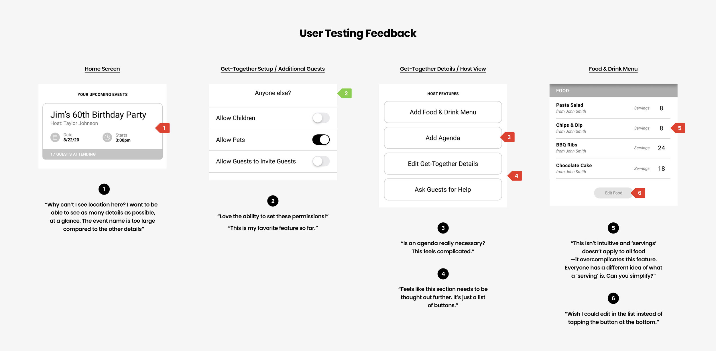
User flows, sketches, wireframes, and a low-fidelity prototype made it possible to begin testing and confirm this solution resonated with users.
Initial thoughts for get-together setup flow, home screen, and get-together detail pages.
Wireframes V1
Wireframes V2
Final Prototype
After addressing user feedback from a second round of wireframes, it was time to develop a final prototype.


